Why visitors bounce in seconds?
Plus, 📨 Inbox zero is not a dream

Hello Readers 🥰
Welcome to today's edition, bringing the latest growth stories fresh to your inbox.
If your pal sent this to you, then subscribe to be the savviest marketer in the room😉
In Partnership with Money
Car insurance costs to hit record highs in 2025

With car insurance premiums projected to reach a record $2,101 annually in 2025, it's more important than ever to make sure you're not overpaying. In fact, switching car insurance providers could save drivers over $1,300 a year, according to a 2024 survey.
See if you could save with Money’s best car insurance list.
Craft Landing Pages That Convert
You may have a compelling product, but if your website design doesn’t immediately make that clear, you’re losing visitors by the second.
Your site’s visual hierarchy — how elements are arranged to guide attention — is often the silent killer of conversions. Most early-stage startups lose leads not from a bad product, but because visitors can’t quickly figure out what the company does.

Here’s how to fix that, no design degree needed:
Principle 1: Size equals priority:
Make sure your most important message, typically your headline, is the biggest thing on the page. Everything else should follow in a descending order of importance.
Principle 2: Contrast draws focus:
High contrast in color, size, or spacing helps direct attention. Make CTAs and key messages stand out with strategic contrast. Avoid clutter that competes for focus.
Principle 3: One idea per section:
Each block of your site should serve a single goal. Don’t cram testimonials and features into the same box. Keep it digestible.
Principle 4: Show what you sell:
Especially in SaaS, include screenshots or product visuals right away. People want to see what they’re getting. No UI = lost trust.
Bonus tip: Run a 10-second test:
Flash your homepage to someone unfamiliar with it. Then ask them what the product does, who it’s for, and what they should do next. If they’re unsure, you have a hierarchy issue.
The Takeaway
You don’t need to reinvent the wheel. Use templates, draw from websites you admire, and focus on making your site easier, not flashier. Better design isn't about fancy animations. It’s about helping people understand, trust, and act.
Reach Inbox Zero Faster
Email overload can kill your focus. But what if you could cut your time in half, without sacrificing quality replies?
That’s where this workflow comes in. With the right tools and habits, you can process emails with lightning speed and get back to work that matters.
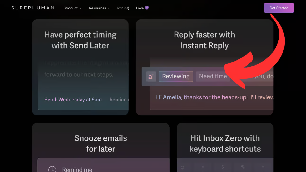
Here's how to build your faster inbox routine:
Step 1: Connect Your Account:
Start by linking your Gmail or Outlook account on Superhuman’s website. Set up filters and clean out the clutter. You want to begin with a calm inbox, not chaos.
Step 2: Master the Shortcuts:
Your keyboard is your secret weapon. Press “E” to archive. Use Command+K to snooze or resurface important messages later. The goal is to touch each email only once.
Step 3: Use AI to Reply Smarter:
No need to write every response from scratch. Hit Command+J, drop in a few bullet points, and let AI craft a polished draft. Edit for tone and send it off.
Step 4: Build a Response Library:
If you send similar replies often, turn them into templates. That way, your next email takes seconds instead of minutes.
Step 5: Block Your Email Time:
Schedule two email sessions a day. Avoid dipping into your inbox constantly. You’ll respond faster, and your day will feel more focused.
The Takeaway
Email doesn’t have to drain your energy. With intentional systems and a bit of AI magic, you’ll be hitting inbox zero — and staying there.
We'd love to hear your feedback on today's issue! Simply reply to this email and share your thoughts on how we can improve our content and format.
Have a great day, and we'll be back again with more such content 😍