The psychology behind easy choices
🧠 Why customers choose good enough, plus turning UI inspiration into live landing pages

Hello Readers 🥰
Welcome to today's edition, bringing the latest growth stories fresh to your inbox.
If your pal sent this to you, then subscribe to be the savviest marketer in the room😉
In Partnership with Shipfusion
When Fulfillment Decisions Undo a Perfect Checkout
Most brands optimize checkout, then assume fulfillment will take care of itself. That assumption is where loyalty quietly breaks.
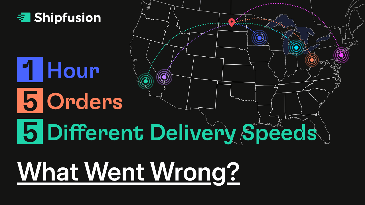
Shipfusion audited five clear protein brands by placing identical orders within the same hour. Same purchase moment. Completely different post-checkout experiences.
The product wasn’t the variable. Fulfillment decisions were.
This audit made the gaps obvious:
👉 Only 1 brand shared a specific delivery timeline, leaving most customers guessing
👉 Five identical orders arrived on wildly different schedules, driven by warehouse and carrier choices
👉 One shipment traveled 2,092 miles, 57% farther than average, adding days and cost that never needed to exist
Whether you’re confident in your customer experience or want a reality check, this report shows how your brand compares. Discover where your brand might be losing momentum and how to turn first-time buyers into lifelong fans.
While rooted in clear protein, these insights apply across supplements, wellness, CPG, and every DTC category.
Download the DTC Delivery Files and audit your post-checkout reality today!
📝 Understand Why Customers Choose “Good Enough”
Most buying decisions are not made by carefully weighing every option. Instead, people rely on shortcuts. This idea comes from the concept of bounded rationality, which explains that humans have limited time, information, and mental energy. Rather than searching for the perfect choice, people look for an option that feels acceptable and move on. This behavior is known as satisficing.
In practice, satisficing often leads to happier outcomes. When people try to maximize every decision, they experience more stress and regret. When they choose something that simply meets their needs, they feel relief and confidence. This is why simplifying decisions is one of the most powerful levers in marketing.
Steps to Design for Satisficing:
1️⃣ Reduce Cognitive Load
Too many options create friction. Narrow choices so customers can quickly understand what matters. Fewer decisions mean faster action.
2️⃣ Show Clear Proof
Instead of explaining benefits in abstract terms, visually demonstrate that your product does what it promises. Clear evidence removes doubt and shortens decision time.
3️⃣ Highlight the Default Choice
When one option is framed as the recommended or most popular choice, people are more comfortable selecting it. Authority reduces mental effort.
4️⃣ Curate Instead of Cataloging
Present a short list of relevant options rather than your full range. Curation signals confidence and guides customers toward a satisfactory outcome.
5️⃣ Eliminate Unnecessary Comparison
Avoid forcing customers to analyze minor differences. Focus attention on the core benefit that solves their problem.
6️⃣ Make Progress Feel Obvious
Clear next steps reassure customers that they are making a sensible decision. Momentum reinforces satisfaction.
The Takeaway
Customers are not searching for the best possible option. They are searching for the option that feels right quickly. When you design experiences that reduce effort, clarify value, and guide attention, you make it easier for people to choose. And the easier it is to choose, the more often they buy.
📝 Turn Any UI Into a High-Fidelity Landing Page
Looking to turn existing UI inspiration into a fully functional landing page without starting from a blank canvas? Gemini 3 Pro makes it possible to analyze real product interfaces and transform them into production-ready landing pages with layouts, animations, and interactions that feel hand-crafted, not AI-generated.
Instead of guessing spacing, colors, or structure, you let the model study how a real interface behaves and then rebuild it as a live page you can adapt to your own product.
Steps to Create a Landing Page Using Gemini 3 Pro:
1️⃣ Capture Real UI Inspiration
Find a design you admire on platforms like design galleries or live SaaS products. Record a short video of the page scrolling through sections instead of relying on a static screenshot. Motion and interaction matter.
2️⃣ Upload and Analyze the UI
Upload the video to Gemini 3 Pro and prompt it to study the interface. Ask it to describe the layout, spacing, typography, color usage, component hierarchy, and interaction patterns as if briefing a developer.
3️⃣ Generate a Structured Design Spec
Request the analysis in clean markdown format. This turns visual inspiration into a clear, reusable design document that explains what makes the UI work.
4️⃣ Convert Insight Into Execution
Start a fresh chat and paste the generated design spec. Then instruct Gemini 3 Pro to adapt the structure to your product and create a high-fidelity interactive landing page based on those instructions.
5️⃣ Iterate Before Deployment
Refine sections, animations, colors, or layouts directly in the prompt. Make adjustments until the page matches your brand and goals.
6️⃣ Export for Development
Once satisfied, export the output into your preferred development environment to finalize and deploy.
The Takeaway
Gemini 3 Pro turns UI inspiration into a repeatable system. By analyzing real interfaces from video and converting them into structured instructions, you can build polished landing pages faster, with more confidence, and without design guesswork.
We'd love to hear your feedback on today's issue! Simply reply to this email and share your thoughts on how we can improve our content and format.
Have a great day, and we'll be back again with more such content 😍