Show gaps to drive decisions
🧠 Why customers think they know more than they do, plus how to turn campaign data into visual decks

Hello Readers 🥰
Welcome to today's edition, bringing the latest growth stories fresh to your inbox.
If your pal sent this to you, then subscribe to be the savviest marketer in the room😉
In Partnership with Section
Ten Truths and a Lie About AI in 2026 – December 9 | Free Virtual Event
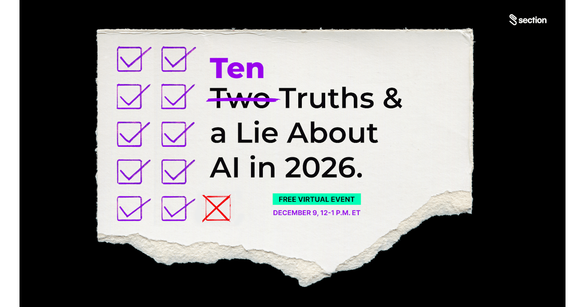
If you feel like everyone is “doing AI” but no one actually knows what’s working, you’re not crazy. Most teams still don’t know what’s real, what’s noise, and what’ll actually move the bottom line.
On December 9, join Greg Shove, CEO of Section, for a rare, insider-only breakdown of what separates AI winners from the rest. This isn’t theory, it’s what enterprise operators are already doing to turn AI from hype into measurable ROI.
You’ll uncover:
- What defines a profitable AI strategy vs. a PR stunt?
- How top orgs are structuring AI investments that scale beyond experimentation.
- The single mistake that’s killing ROI for 90% of teams.
Greg’s taking off the filter, sharing insights usually reserved for Section enterprise clients.
📝 Understand the Illusion of Explanatory Depth
People think they understand far more than they actually do. Yale researchers found that when participants were asked to explain how everyday objects like zippers or toilets work, their confidence dropped sharply.
What felt familiar suddenly felt complicated. This cognitive bias is known as the Illusion of Explanatory Depth, the gap between what we believe we know and what we can truly explain.
For marketers, this bias shapes how customers interpret your products, your messaging, and even their own problems. While customers think they understand their needs, their actual knowledge is often surface-level. Smart marketers bridge this gap by shifting from assumptions to data, then explaining solutions clearly and patiently, as if the customer is hearing them for the first time.
Steps to Use This Psychology in Your Marketing:
1️⃣ Reframe What Customers Believe:
Most people misunderstand the root of their problem. When you reframe the cause, your product becomes the obvious solution. This shifts the conversation from why your product is better to why the customer’s current belief is incomplete. When buyers realize their existing approach solves only part of the problem, they become open to a new answer.
2️⃣ Turn Confusion Into Clarity:
Quizzes work because they reveal blind spots. By asking simple, layered questions, you guide customers from vague concerns to specific needs. When they see their real problems with new clarity, your recommendation feels natural rather than sales-driven.
3️⃣ Make Best Practices Foolproof:
Customers think they’re doing things right until shown otherwise. Tools that break complex tasks into simple steps instantly boost confidence. When your offering provides structure, customers feel guided, not overwhelmed, and become more likely to choose you.
The Takeaway
When marketing exposes hidden gaps in understanding, customers become open to new solutions. Shine a light on what they don’t know, reframe the problem, and your product becomes the logical next step.
📝 Turn Raw Data Into Clear Visual Insights
Working through campaign data often means juggling spreadsheets, charts, and manual formatting. NotebookLM changes that by automatically transforming your notes, files, and analytics into clean infographics and ready-to-present slide decks. Instead of spending hours arranging visuals, you can focus on interpreting the story behind the numbers.
Below is a step-by-step workflow to turn messy inputs into polished presentations in minutes.
Steps to Create Visual Insights With NotebookLM:
1️⃣ Add Your Data Sources:
Start by opening NotebookLM and clicking Create new. Import your materials by connecting Google Drive, pasting text, or adding links. You can bring in performance metrics, campaign learnings, customer notes, or any document you want analyzed.
2️⃣ Let NotebookLM Analyze Your Inputs:
Once uploaded, NotebookLM reviews, summarizes, and organizes the information for you. To generate an infographic, select the infographic option from the right panel. Choose your preferred layout, orientation, and detail level. You can even customize colors to match your brand.
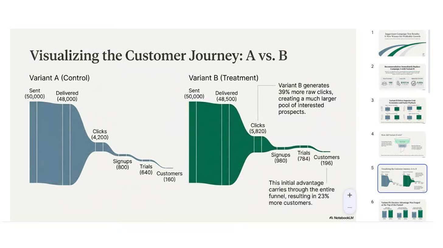
3️⃣ Generate a Full Slide Deck:
For deeper analysis, create a slide deck. Choose a length such as short for summaries or long for full breakdowns. Select your language and add instructions like Highlight which variant performed strongest for profitable growth. NotebookLM builds the deck automatically with charts, recommendations, and structured explanations.
4️⃣ Review and Refine the Output:
Your generated deck includes visualized insights, campaign performance trends, customer journey breakdowns, and appendices. You can download it as a file, share it directly with your team, or switch to presentation mode to deliver it immediately.
The Takeaway
NotebookLM helps you turn data into visuals instantly. Whether you are analyzing campaigns or learning complex topics, the ability to convert dense material into infographics and clear slides saves hours and boosts clarity.
We'd love to hear your feedback on today's issue! Simply reply to this email and share your thoughts on how we can improve our content and format.
Have a great day, and we'll be back again with more such content 😍